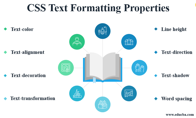
CSS Essential

Text Properties

Some basic text properties are:


Trick->Avoid using more ids or classes,there are different approaches through which you can select your content

Selectors

There are some basic selectors like figure below


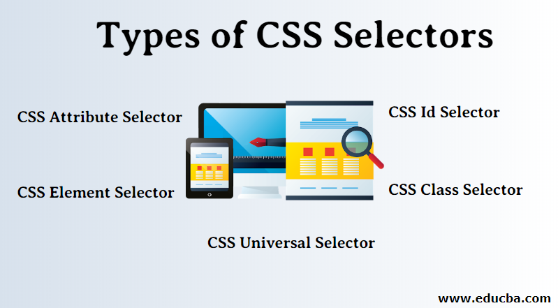
there are some other ways to select the content:

  1. Descendent Selector 

space between two selectors create descendent selectors

here p .para is the descendent selector which will select .para class inside p

2.The Adjacent & Direct-Descendent Selectors

Above image is adjacent selector where h1 and div are adjacent to each other so it will select all the div which are adjacent to h1

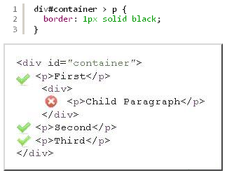
Direct descendent are selected by > sign so in above ex all p with tick sign are direct descendents but one with cross sign comes under another div

3.Attribute Selector

input[type="email"]{}=> This selector will select all email types input

4.Psuedo Class Selector


there is one more selector nth of type selector:nth of type(3n)->it will select every 3 element.One more examples of nth of type is below


ent

Pseudo Elements

1.::first-letter

h1::first-letter {
    color: red;
}

2.::first-line

P::first-line {
    color: red;
}

3.::selection

p::selection {
    background-color: #bc6c25;
}

4.::after

h1::after {
    content: "->This is H1";
    color: chartreuse;
}

5.::before

p::before {
    content: "Dummy Text->";
    color: #fc119a;
    font-size: 40px;
}


Trick->Order matters in css
h1{
    color: red;
}
h1{
    color:blue;
}
blue wins

Trick->Specificity calculator(click Me) is used to calculate the score of selector if there is conflict.
Generally order is id than class than elements but its better to check in calculator

Box Model

Box model in css means everything is box and those boxes have different properties

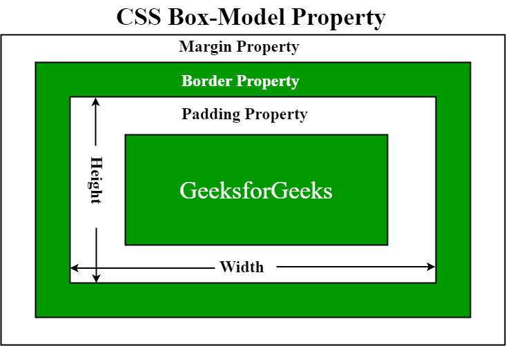
Trick->Box-sizing:border-box will maintain the width of the element for example you have a div
with width 200px and border with 5px then total width of the box will be 210,5px added in both sides
but if you do box sizing border-box it will be exact 200px including border.

Display Property

1.Inline

In inline elements width height margin padding is not applied and if applied
somewhere horizonataly or verticaly than it is not respected by adjacent elements

span {
    background-color: yellowgreen;
    border: 2px solid red;
    padding: 100px;
    margin: 100px;
    width: 200px;
}

This is how element behave there was no width applied margin was applied only horizontally
padding was applied vertically and adjacent elements are not respecting it

2.Block

All width height margin padding of block level elemnets are respected by adjacent elements

3.Inline-Block
It behave as a inline element but every property like width,height etc are respected
div {
    background-color: aquamarine;
    border: 5px solid white;
    width: 300px;
    padding: 50px;
    margin: 20px;
    display: inline-block;
}

CSS UNITS

1.Absolute Unit

There are many absolute unit but most commonly used one is pixel (px).
Now it is generally ignored by adjacent elements so its better to avoid px in responsive websites.

2.Relative Unit

  • Percentage

It changes width and height retaltive to its container. Suppose you have div with width and height of 400px.
You have h1 inside the div if you set the width and height to 5
0% then its width and height will be 200px.

  • em
its kind of tricky so plz focus.

div {
    font-size: 30px;
}

div h1 {
    font-size: 2em;
}
Now here h1 is the child of div and its size is 2em which is the double of its parent
So here h1 font size will be 60px ie font size will be relative to its parent font size

div {
    font-size: 30px;
}

h1 {
    font-size: 2em;
    width: 5em;
    padding: 2em;
    border: 3em solid red;
}
Other than font size other properties change relative to its font size
so here h1 have the font size of 2em(ie 60px double of its parent fontsize).
Width,padding and border will change relative to h1 font size
so width=300px(60*5)padding=120px(60*2)border=180px(60*3).Now
if i reduce div font size it will impact the size of h1.

  • rem

it changes its size relative to root element font size ie <html> and its default font size is 16px.
In some scenerios its better to use rem compare to em.Example if you have nested li and u set the ul font size to 2em.
the innermost ul will be very large(think about it bcoz it changes its font size relative to its parent).So to avoid such scenarioes
rem is used which will have common parent element

Position Property

1.Static Position
This is the default position no top,left,right or bottom can be applied in static position.

2.Relative Position
if we set position relative then it will remain in its normal flow, the space  will always be present even if you change its top,left,rigtht etc.

Original Position

Relative Position


 #relative #middle {
    background-color: salmon;
    position: relative;
    top: 100px;
    left: 200px;
}
Middle box is position relative but notice original space is
already there.so its adjacent elements are respecting its space and its moving
relative to itself

3.Absolute Position
It leaves its original position and changes its position
relative to its closest parent element if its position is relative
otherwise it changes its position relative to body.
Trick->if you want to constrict absolute element within its container
change container to position relative

#absolute #middle {
    background-color: salmon;
    position: absolute;
    top: 200px;
    left: 300px;
}


Notice middle element space is taken over by adjacent
element and its position is changed relative to its parent
element

4.Fixed Position
Fixed position in one way behave like absolute, when you position
an element fixed it will leave its original space and that space
will be captured by adjacent elements. Difference is it changes its position
relative to its initial containing block ie browser window
you cannot contain it in a relative container and it is fixed to
its position even while scrolling

5.Sticky Position
So its complicated pay attention,I will give you one example to explain
    <section id="sticky">
        <h2>sticky</h2>
        <div></div>
        <div id="middle"></div>
        <div></div>
    </section>

This is HTML here div with id middle is positioned sticky
#sticky #middle {
    background-color: salmon;
    position: sticky;
    top: 100px;
}
So here are the points to notice
1.Sticky element will always remain inside its immediate parent here
its section with id sticky.
2.Adjacent elements will respect its space and even if its move will not capture its space
like relative position
3.it will get stick to its position until its container is in window
while scrolling if container goes out of window then sticky element will also go

Transition

Introduction

The best way to explain transition is like putting oil in your bike.
when you put oil it starts to run smoothly there will be no jerking
same happens in transition. It is normally used when you want to hover any element
Important points to notice
  • Dont use transition all,use it seperatly
 transition: background-color 2s, border-radius 1s;
  • Generally use the transition time of .5s or 1s
  • There is one website called easing.net here youcan select transition timing function like ease-in,go visit website you will understand

Transform

It transforms the element through rotate,scale,traslate etc
->There is one transform origin where you can specify from where you want
your transformation to start like bottom-right,top-left etc
1.Rotate
It rotate the element based on degree given
HTML
<section>
        <h1>Transform me!!!!</h1>
        <h1>Transform me!!!!</h1>
        <h1>Transform me!!!!</h1>
        <h1>Transform me!!!!</h1>
        <h1>Transform me!!!!</h1>
    </section>
    <section>
        <h1>Transform me!!!!</h1>
        <h1>Transform me!!!!</h1>
        <h1>Transform me!!!!</h1>
        <h1>Transform me!!!!</h1>
    </section>
CSS
section:first-of-type h1:nth-of-type(1) {
    transform-origin: left;
    transform: rotate(90deg);
}
Here notice selector also good way of selecting first we
select 1st section then 1st h1.
Output

2.Scale(resizing)
section:first-of-type h1:nth-of-type(2) {
    transform-origin: center;
    transform: scale(2)
}
3.Translate
Take one element and move it around relative to its current position
section:first-of-type h1:nth-of-type(3) {
    transform-origin: center;
    transform: translate(300px, 50px);
}
here the first value is x axis and second is y axis,you can
use negative value also and it will have opposite effect
4.Skew
Angle the element
section:first-of-type h1:nth-of-type(4) {
    transform-origin: center;
    transform: skew(15deg, 20deg)
}

Important-You can combine the properties together

section:nth-of-type(2) h1:nth-of-type(1) {
    transform: rotate(20deg) scale(1) translate(-100px,100px) 
skew(120deg, 190deg);
}


 What is flexBox

it is a one dimensional layout method used to laying our items in rows and columns.The basic properties of flexbox which i know are

  • display:flex;
  • flex-direction
  • justify-content
  • align-items
  • flex-wrap
  • align-self

Align Content

if we have many rows and columns with flex-wrap as wrap and we have to control the space between rows and column then align-content is used with properties center,flex-start,flex-end,space between etc.before align-content we have this structure


#container {
    background-color: #003049;
    width: 90%;
    height: 500px;
    margin: 0 auto;
    border: 5px solid #003049;
    display: flex;
    flex-direction: row;
    flex-wrap: wrap;
}
#container div {
    width: 300px;
    height: 200px;
}
But after align-content:center it looks like this

#container {
    background-color: #003049;
    width: 90%;
    height: 500px;
    margin: 0 auto;
    border: 5px solid #003049;
    display: flex;
    flex-direction: row;
    flex-wrap: wrap;
    align-content: center;
}

Flex-sizing Properties

it deals with the individual items properties
1.flex-basis
initial width of item before any extra space is applied.

2.Flex-grow
it will grow the individual item and take the extra space

3.Flex-shrienk
It will shrienk the paerticular item while reducing the window size

Imp->There is one shorthand property as flex which take 3 values
flex-grow flex-shrienk,flex-basis in the same order

Media Queries

To make the site responsive media queries are used

 CSS Grid

It is a 2 dimensional way to create the layout for the web pages

Grid Template colomn

It divide the items inside the container into desired columns

HTML


CSS


Output


   Other ways to write grid template column are:

  grid-template-column:300px  100px 100px;

  grid-template-column:1fr 4fr 1fr;

grid-template-column:300px auto 200px;


Grid Template rows(Not used much)

It is same as grid-template-column but it will generally define rows.Here is the code

grid-template-rows:1fr 2fr 2fr;

this will create three rows with the above fraction and if there is extra row then it will be 1fr.

Grid Gap

As we have done coding and used grid gap so many times so want to share that you can give row and column gap seperatly ex

grid-row-gap:1rem;,grid-column-gap:5rem;


You can clearly notice that column have more gap than row


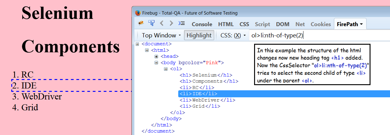
Spanning Of Grid(Very Important)

So i will tell you the trick which i understoood after practicing few times.So first count how many divs are in container and then divide it equally with grid-template-column ex if 4 div then grid-template-column:repeat(4,1fr); then with individual box do the spanning.Here is the example to make you understand.


Above is html


As you can see above in css file that div is divided into 4 equal parts

Currently the output is like above divided 4 equal divs.Now here comes the magic


In above code we have span row and column and the out put is like this


Now here is the important thing that create confusion when you count the span then you count the box or column whatever you want to say but when you count starting point then you count the border of the box ex in .box:nth-of-type(2) in above figure two columns are merged  bcoz of first box span 2 so it will start from 3 border(imagine in your mind when two boxes are merged what will be the count of second box right border) Hope You get the point,Now one more thing  at this point if you comment grid-template-column also there will be no effect and for responsiveness you need media query

Note-You can study auto-fit min-max() in harry course if you dont want to use media query for responsiveness.but if your layout is quite critical then it will disturb your layout better to use it when you have equal distribution of columns.


Grid Template Area


if you want to achieve the above layout then it can be done easily with the help of grid-template-areas plz see the code below


Here we define the grid area of each box and then use that name in grid-template-area .It is just this simple and for responsiveness you can again declare grid-templates-area in media query

 What is bootstrap

bootstrap is a css framework used to design our website.It basically consists of two elements.

1.Components-components consist of buttons,badge,nav etc that can be useful to add in our website.

2.Grid System-it is used to design layout of our website which makes our website very responsive.

Important Component

  • Container & Container-fluid 
  • buttons-There color is just the label dont focus on color you can modify it focus on label like primary,success,danger etc
  • badge
  • Nav

Typography

  1. Display-1/2/3/4-Display-1 class is used to display heading at slighly large size and different style.
  2. lead->it can be used for lead text of the page.Font size is greater and font-weight is extra.
  3. BlockQuote->It is used for quotation purposes
  4. BlockQuote-Footer->Here the name of the author will come
Grid System
grid is used to design the layout of the website but one thing to make sure is that grid can only be used inside container whether its normal or fluid
Inside the container you have to create row then each row have 12 units which you have to divide accordingly among column. If unit gets extra that column goes to next row and take the given space

Here 12 units of row is divided into 3 columns of unit 2,6 and 4 with syntax col-2,col-6,col-4
Responsiveness In Grid
Ok so here the main factor to understand is the decision of breakpoint.I will explain with example
I have row with 4 colms.So it full screen i want it all equally divided
So i wrote col-xl-4 on each col. Now when it comes to large break point or medium break point
i want each col to take50% of the row. So Pay ATTENTION if you select large breakpoint ie col-lg-6 it will create 2 columns in a row but as soon as it reaches medium break point it will again have 4 cols.so in this scenario i will select col-md-6 so that it can apply to medium and above breakpoint and in any above break point i want any change i can write it.
So to make site look like this. I will write col-md-6 col-xl-4.For small and extra small it will automatically take 12 units like image below nothing to write for this functioning


Grid Utilities

align-item-start/center/end
align-self-start/center/end
justify-content-start/center/end

Bootstrap Css (Paste It In HTML Page)
 <link rel="stylesheet" href="https://stackpath.bootstrapcdn.com/bootstrap/4.5.0/css/bootstrap.min.css"
    integrity="sha384-9aIt2nRpC12Uk9gS9baDl411NQApFmC26EwAOH8WgZl5MYYxFfc+NcPb1dKGj7Sk" crossorigin="anonymous">

Bootstrap Script(Paste It In HTML Page above closing of body tag)
  <script src="https://code.jquery.com/jquery-3.5.1.slim.min.js"
    integrity="sha384-DfXdz2htPH0lsSSs5nCTpuj/zy4C+OGpamoFVy38MVBnE+IbbVYUew+OrCXaRkfj"
    crossorigin="anonymous"></script>
  <script src="https://cdn.jsdelivr.net/npm/popper.js@1.16.0/dist/umd/popper.min.js"
    integrity="sha384-Q6E9RHvbIyZFJoft+2mJbHaEWldlvI9IOYy5n3zV9zzTtmI3UksdQRVvoxMfooAo"
    crossorigin="anonymous"></script>
  <script src="https://stackpath.bootstrapcdn.com/bootstrap/4.5.0/js/bootstrap.min.js"
    integrity="sha384-OgVRvuATP1z7JjHLkuOU7Xw704+h835Lr+6QL9UvYjZE3Ipu6Tp75j7Bh/kR0JKI"
    crossorigin="anonymous"></script>

Decent form you can take idea from
    <form action="#nowhere" method="get">
      <div class="form-row row ">
        <div class="form-group col-md-6">
          <label for="email">Email</label>
          <input type="email" name="email" id="email" class="form-control">
        </div>
        <div class="form-group col-md-6">
          <label for="password">password</label>
          <input type="password" name="password" id="password" class="form-control">
        </div>
      </div>
      <div class="form-group">
        <label for="address">Address</label>
        <input type="text" name="address" id="address" class="form-control" placeholder="Aratt Premiere">
      </div>
      <div class="form-row">
        <div class="form-group col-md-6">
          <label for="city">city</label>
          <input type="text" name="city" id="city" class="form-control">
        </div>
        <div class="form-group  col-md-3 col-6">
          <label for="state">State</label>
          <select name="state" id="state" class="form-control">
            <option value="karnataka">karnataka</option>
            <option value="M.P">M.P</option>
            <option value="U.P">U.P</option>
          </select>
        </div>
        <div class="form-group col-md-3 col-6">
          <label for="zip">Zip</label>
          <input type="text" name="zip" id="zip" class="form-control">
        </div>
      </div>
      <div class="form-group">
        <div class="custom-control custom-checkbox">
          <input type="checkbox" class="custom-control-input" id="customCheck" name="example1">
          <label class="custom-control-label" for="customCheck">SignUp</label>
        </div>
      </div>
      <button type="submit" class="btn btn-success">Register</button>
    </form>

ml-auto
If you want to move a div to right side and there is a space then give that div a class of ml-auto

fixed-top
This class you can use in navbar to make it fixed to top

Bootstrap-Icons
They are kind of fontawesome but its cool can give it a shot

Shadow Class
Check this out it will make work lot easier

Responsive Padding/Margin
Notice the code which i am writing to make button responsive button Try it
 <button class="btn btn-danger p-0 p-sm-1 p-md-2 p-lg-4 p-xl-5 ml-auto">I Change</button>
  </div>

.d-none
You can display none and can also add breakpoints like .d-none.d-md-block
check out in bootstrap website

Comments

Popular posts from this blog

Internet & Web

Internet Internet is connection of various devices around the world each device is identified through its IP address which are connected through  routing.I n routing there is one common device(router) which pass my data to some other devices viceversa. Above image is a small example but its huge with so many networks connected together.Below image just show the fraction of internet Now for example you are taking internet service from airtel then they will bring cable and connect it to your home router from where u can access the internet in the same way airtel is also taking internet from somewhere what i mean to say that there is lot of cabel distribution under earth and ocean to enable the Internet Web web is a system  to share the information over the internet .Each information is identified through its URL(ex facebook.com,google.com) and these information are transferred through protocol(set of rules and regulation) HTTP HTTP HTTP(Hyper Text Transfer Protocol)  transfer the informa